Design Isn’t Black And White
Do you ever feel like much of contemporary graphic design looks the same? You're not imagining things. It’s because the overwhelming majority of designers are two of the same things: white and male. Tré Seals is trying to change that with Vocal Type.

There was a time when Tré Seals didn’t really want to tell his story. Instead, he let his work speak for him. And it did a pretty good job, considering the graphic designer is one of the most talented visual storytellers of his generation—as a designer and typographer has been turning out industry-shifting logos, typefaces, and all manner of award-winning campaigns since he was a teenager. But the longer he worked, the more he became acutely aware of the importance—and distinctiveness—of his story. From a brain tumor diagnosis at age 4 that led him to take up the calming practice of cursive to finding success within an industry where Black men make up less than 3 percent of the professional workforce, Tré began to understand that what he had to offer was inextricable from who he was.
On the flip side, he realized why, when scrolling through existing typefaces and the designs of his contemporaries, he was finding it so hard to get inspired. It sometimes felt like he was staring into an infinity mirror, with the same styles and perspectives simply repeating themselves over and over. “When a singular perspective dominates an industry, regardless of any advancements in technology, there can (and has been) only one way of thinking, teaching, and creating. This lack of diversity in terms of race, ethnicity, and gender, has led to a lack of diversity in thought, systems (like education), ideas, and, most importantly, creations,” Tré explains.

Tré Seals in his D.C. studio.
So, in 2016, Tré launched Vocal Type with the goal of diversifing design through typography. His current gig is part historian, part typographer—each new typeface he creates is based on a piece of history from a specific underrepresented race, ethnicity, or gender—from the Women’s Suffrage Movement in Argentina to the Civil Rights Movement in America. There’s Eva, a font family inspired by banners carried during a 1957 demonstration for women’s suffrage led by Eva Perón in Buenos Aires. There’s Marsha, a font family inspired by the sign that once hung outside of Stonewall, and named after Marsha P. Johnson—an African-American, transgender woman from New Jersey, whose activism in the 1960s and 70s made her one of the most prominent figures in the Stonewall uprising of 1969. There’s Martin (no introduction needed), Ruben, Carrie, and James. And then there’s Bayard, named for MLK-advisor Bayard Rustin and inspired by signs from the 1963 March On Washington For Jobs and Freedom. This one is extra special to us here at REP CO, as it’s the font used in our own logo, designed by David Rager.

When David presented the logo to me, along with the story of Tré and Vocal Type, it helped to clarify REP CO’s mission and our purpose in such a profound way I was taken aback. I immediately knew this wasn’t just going to be our look, but a story that exemplified what we aim to do here. So, I asked David, who is a celebrated designer (but admittedly a novice interviewer) to sit down with Tré for an honest conversation about design, it’s inequities, and it’s power. The resulting interview, below, tells Tré’s story better than I ever could. Which, it turns out, is exactly the point.
David: When you go to the homepage, the first thing you see there is some text—it's kind of a page floating on a rocky outcrop that says “diversifying design. preserving culture. crafting typefaces.” Could you speak to those three lines and how you chose them as a way to introduce your project to new people?
Tré: Definitely. As far as diversifying design is concerned, it was really the reason I started Vocal. It wasn't that I was wanting to start a font foundry or anything like that. I love type, but as a graphic designer doing a lot of branding projects, I got really bored. And when I would be searching for inspiration and aimlessly scrolling fonts, it just made the process so monotonous. I was trying to be inspired, but everything kind of looked the same to me. And when I found out that only 3 or 5% of graphic designers in America are Black, and graphic design is like majority male, and I think 80-something-percent Caucasian, it kind of made sense why everything looks the same. I realized that when you have one dominant culture within an industry, that culture kind of dictates how everything should be taught how everything should be done. And it kind of got rid of any creativity that results from other cultures. So I started Vocal to diversify design.
David: That’s fascinating to me, because I come from a fairly vocational background and I ran a letterpress shop when I was in school and I had to memorize the job case and, you know, set type by hand myself. It's a lost art, but also, typography is something so powerful because it's a basis of communication. And historically people who had access to Movable Type or type reproduction also had a lot of power because of that ability. It's an interesting space to shift your focus to. Can you speak to why you chose typography specifically?
“When you have one dominant culture within an industry, that culture kind of dictates how everything should be taught how everything should be done.”
Tré: So, I hadn’t realized this at the time—before Vocal Type—but type has always been a part of my life. It's a long story, but my design journey began at the ages of four and eight. I had a brain tumor. I was born with it and as I grew, it grew with me till it became about the size of a golf ball. And throughout those two ordeals, drawing and writing really became my only means of coping with the pain. When the tumor was gone, I needed a way to express what I was feeling, so drawing and writing became my only means of doing that as well. So, I either drew my heart's content or practiced writing in cursive until I could get my handwriting to look like the sample sheets. And after that, in the fifth grade, I started my first business graffitiing people's names on index cards for $3. In high school I designed and hand-lettered tattoos. During my senior year of high school I actually started drawing my first font. I didn't know anything about type design back then, but I figured one day I’d learn and be able to release it to the world. In 2013, I still didn't know anything about type design but I knew a lot about (Adobe) Illustrator, so I released it as a vector font on Behance, and since then it has been downloaded over 30,000 times. But I stopped counting because I kept kicking myself for not charging at least 50 cents. But that got me started and really interested in type. I didn't pursue it much after that, outside of branding and designing monograms and logos and wordmarks. However, when I graduated in 2015, I started working for this staffing agency where I had the opportunity to work for nine or 10 different companies, in-house, agency, studio, and everything in between.
So by the time I started Vocal I worked with almost 200 clients. And so I really had a good understanding of what kind of designer I wanted to be and what kinds of clients I wanted to work with. And by 2016 I was already getting bored after doing that much work and going through the same process over and over again—the process of aimlessly searching for inspiration and scrolling through fonts. And when I started looking back on my life, thinkinking about the days of designing Unveil, drawing tattoos, graffiting people's names on index cards, and practicing cursive, starting a font foundry just made sense.
However, in thinking about ways to diversify design, I also had to think about my racial experiences—like the racism and bigotry experienced in the workplace, the time I got stopped by 4 cops in Minneapolis, the first time I was called the “N word,” and the first time I experienced racism. Beyond this, I also had to think about my positive racial experiences, like the support I’ve received through the Vocal community, and the pride in learning Black and brown history: like the stories of Dr. King, Bayard Rustin, Eva Peron, Dolores Huerta, Ruben Salazar, and so many others. I wanted to find a way to share that pride through type.
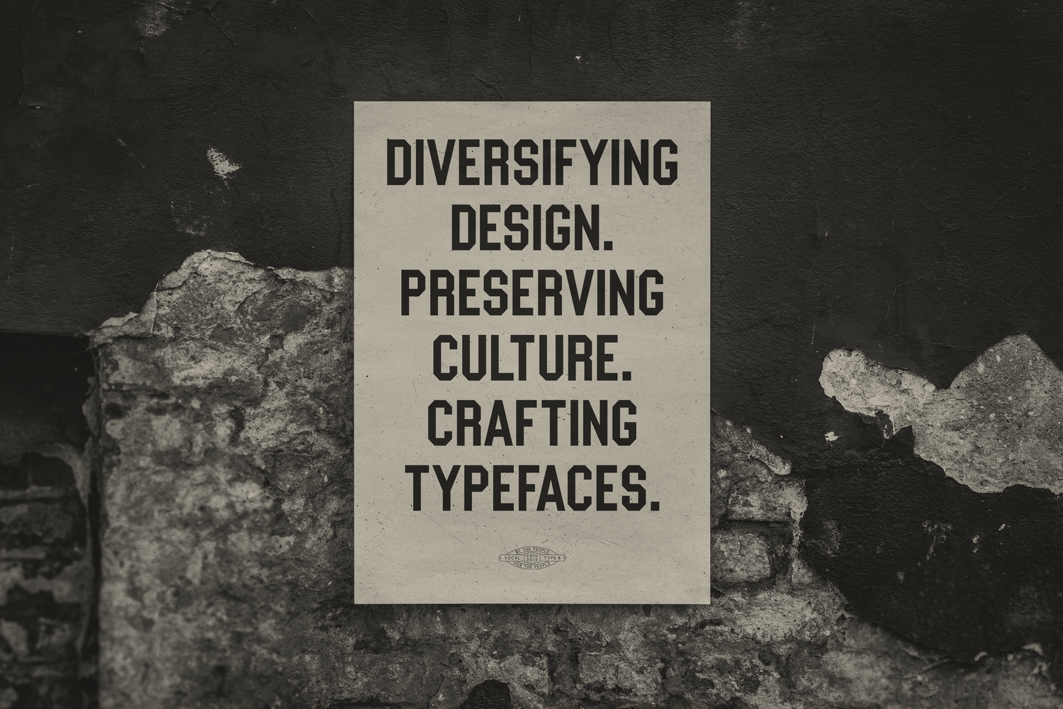
David: And going back to the three lines that you see when you enter the Vocal Type site, it’s set in what looks like a condensed version of a work-in-progress typeface that you're working on. It's called William, and that typeface is based on a handmade typeface used on data visualizations created by W.E.B. Dubois. It's not only a beautiful typeface, but it's powerful, and the power really comes from the context. Can you talk about how important context is to the work you do at Vocal?
Tré: William is so interesting. I think it's the first font that I've done that wasn't based on a protest, or what we traditionally consider a protest. Dubois was more of a behind-the-scenes activist. He was an American sociologist, historian, civil rights activist, author, writer, and editor. While I’m in love with the entire story of the font family, I also felt like I needed some sort of text face. However, once I started, it snowballed into a huge project that I’m hoping to have done soon.
What I found most interesting about William was the fact that it was created back in 1900, which was 20 years before Bauhaus, for the Paris World Fair. For that time, to see a sans serif in such a public forum, I just felt was so interesting and unusual. To see so many aspects and principles of Bauhaus designed by this activist 20 years before their founding, kind of redefines design history for me.
David: And this might be too geeky for some of the readers, but do you know anything about the origin of that typeface? When I first look at it, it almost reminds me of Ed Ruscha’s Boy Scout (Utility Modern) typeface. Do you know anything about the history of how this typeface was created? Because at the time it would have been, you know, a pretty unusual step to take, to do such a different style.
Tre: We don't know much about it. From what I know, there was a team of students working on this. And while they may look small when viewing each infographic individually, these were poster-sized. Logically, I think part of the reason that it's a sans serif is probably because it was just easier to create some sort of consistency, especially with the absence of curves. However, there are theories behind the design. For example, some people think a stencil was used. I like to believe it was completely hand drawn and they simply used a grid to draw it as you can kind of see the grid lines on some of the infographics. But no one really knows.
David: It may have been easier to stick to specific angles and things like that. It's also interesting to me that I didn't realize that it was what the body copy of your site was set in, until I took the time to notice it. We've been told our entire careers: Body copy is better set in certain typefaces for readability, but that's not what I experienced. In fact, I didn't even register that that was the typeface of your site, until I took a moment to do that. So, it would be against a lot of designers training and programming to even approach it that way.
Tré: Definitely. As I was working on this, I decided to start drawing lowercase characters because in the original infographics, it was set in all caps. So I took a lot of liberties in drawing the lowercase characters. I ended up creating two sets of lowercase alphabets: one set was inspired by the uppercase characters; the second set has more redacted features. And I realized that the second version was actually more legible at small sizes, which I found really interesting, considering that it doesn't follow the normal calligraphic structure of what's supposed to be appropriate for text face. Ever since then, I’ve been finding new ways to push legibility. I'm actually working on another typeface right now specifically for Vocal, and it's a stencil serif that actually works really really well at small sizes.
David: Oh wow. I'm excited to see that. Yeah, it's interesting, in my career I had never thought about the type being something that was political until about 10 years ago. I was living in France and doing some freelance work, and the creative director looked over my shoulder and made a comment—the only comment he had on any of the design work I was doing—he said that the typeface I was using, Din, was not allowed in his shop. He's Jewish, and it was too connected to him to the foundational typefaces in Germany, and he just had this strong reaction to it. And I think in larger public culture we don't really think of things that way unless we see something super stylized, like Fraktur being a black letter font associated with Nazis. And it seems like what Vocal is doing is almost the exact opposite of that. It's taking things that are hidden and meaningful and bringing them to life or surfacing them.
Tre: Interesting, I never thought of Din as being a typeface associated with Germany. I always just thought of the geometric structure as something very European. I never thought of it based on where it comes from. But one thing I've always noticed and have been trying to figure out how to really define are stereotypes in typography. For example, I notice in many different articles about a Black person you will usually see a black weight typeface used. Or how the majority of Chinese or East Asian restaurants have this brush script typeface. Anything Irish is art nouveau. There are so many examples, and lately I've been trying to figure out how to really define these stereotypes and break them down by culture.
Most recently, I had a few conversations with designers who went as far as saying that Helvetica, Garamond, and the Swiss grid are their Confederate flags and statues. When you think of graphic design pre-1990, these things were exclusive tools of a club with a sign that read “Do Not Enter.”
“I had a few conversations with designers who went as far as saying that Helvetica, Garamond, and the Swiss grid are their Confederate flags and statues. When you think of graphic design pre-1990, these things were exclusive tools of a club with a sign that read ‘Do NoT Enter.’”
David: Wow, that's definitely something new—something I hadn't heard—and is kind of eye opening and and freeing, in a way...But then, you know, a lot of our conversation circles back to education and what we're taught, what's embedded versus what's intuitive. And you talk a lot about having facts and data to back up your work. But then there's also the emotional side of things—intuition and experience. How do you find the balance in the work that you do—the parts that are rooted in data and research versus the parts that are more your gut.

Robert Abbott Sengstacke/Getty Images
Tré: It's all kind of emotional. For example Martin was the first typeface that I had ever designed. It was iinspired by the Memphis sanitation strike of 1968, and it was the last cause Dr. King ever got to fight for before his assassination that year. And during that March people carried the signs that said I AM A MAN because almost all the Memphis sanitation workers were Black men. And I think it was, maybe a few months before designing Martin, I'd seen this project where someone had designed the same I AM A MAN posters for the Women's March on Washington, but they had graffitied over the word MAN and wrote “WO”. It won some awards, but I felt kind of insulted. I felt like the agency who designed those signs didn't know the history behind it, or even worse, didn’t care to know.
That phrase, “I AM A MAN,” that was used on those signs came from a question abolitionists posed over 100 years prior: “Am I Not A Man And A BROTHER.” I believe it was 30 or 40 years after this campaign that another version was created that said “Am I not a woman and a Sister.” What they didn’t understand was that at the time that they made the first version, women weren't allowed to participate in politics. So by grafftiing over this historic sign that’s engrained in black culture, “I am a man” went from being something empowering to something disrespectful. I understand what they were trying to say. I would have been completely fine if they had just remade the type and just said I am a Woman. But, it's the fact that it was graffitied over, I felt like it kind of decimated this historical event. Long story short, there's always some emotion in my decisions.
David: That's not just a lot of emotion, it's a lot of thought. And research. And I wonder if the person who made that sign just saw a picture of a sign and said, ‘oh this is cool’ and, well, it's a pretty easy design shortcut to add graffiti to something. And it may have just been ignorance, which speaks to how important it is for designers to do their homework. Obviously, there's a lot of CSI-type typography research that goes into the work that you do. How do you begin? I mean, I can't even imagine how you get clear ideas of how you can build the alphabet when you just have maybe a handful of letters to begin with.

Tré: t's hard. There are multiple processes involved. It's 25% research, 25% design, 25% research, 25% design. Earlier on, when I first started Vocal, I was working on this one font, named after this Asian American who was a high ranking member of the Black Panther Party. And during that time, Asian communities and the Black Panthers, they kind of joined together. As I was getting ready to release this font inspired by him, I found out that he was actually an FBI informant. So, that ruined the entire story. I didn't publish it, I didn't tell anybody about it, I was done. Next.
So, I'm always careful to continuously do research during the design process, and not just do all my research in the beginning and wait until the end to design. So, that's part of it. But as far as finding the type, I either start by finding a certain movement and then finding an activist associated with that movement or vice versa. And then honing in on specific events associated with both that person and that movement. And then from there I start to look for signage that was a part of that event.
And I never focus on one sign that one person carried. I always look for type that multiple people have a connection to. For example, it might be a sign that 400 people carried, or it might be an oversized banner that 10 people carried. By following this model, it kind of adds a sense of unity to the piece. So, that's part of my process for actually finding what I'm going to work on.
David: That's fascinating. And do you think that your instinct to research is something you learned? Or is it something that is part of your character? Have you always been that way?
Tré: My family history is pretty amazing to me. For example, the studio I’m in right now was built by my great great-great grandparents back in 1911. My great-great-great-great grandmother owned a large portion of the town that I'm living in right now, and she was an entrepreneur. She ran a boarding house and foster home, she would loan money, she was on the board of a bank, she'd sell property—she did everything. And I was always surrounded by antiques growing up, which sparked my curiosity, and made me want to learn more. We actually still have her wedding certificate from 1908. And just looking at all these antique documents and antique books that she owned, all of these things kind of sparked my interest in history and continue to inspire me.
David: Do you consider yourself an activist?
Tre: I honestly never thought about it until two weeks ago. I was speaking at Typographics and someone asked what I thought about making a font inspired by my own story because, by working with Vocal I am an activist. And I never thought of it like that. I honestly don't know. Yeah, I mean, I feel like I'm a different type of activist, or not even an activist, I'm just a supporter. I just want to support underrepresented communities and that that's my goal.
David: Are there specific activists or activism movements that you look back to for inspiration to create change today?
Tré: Definitely. I'm a firm believer that history repeats itself three, four, five, six times. And I'm always looking to the civil rights movement, because there were so many other movements that aligned with it. Like Dr. Martin Luther King supported not only the Civil Rights Movement, but was also a voice Asian Rights, Hispanic Rights, ending the Vietnam War, religious freedom, and so much more. And I also look to the Black Panthers for some things. Because I'm always interested in how the Black Panthers are presented to the public, like they're supposed to be this nuisance and they're supposed to be violent, but people don't realize that they never said ‘Black Power’ all the time, they said, ‘All Power To The People,’ so I am always looking to them for some aesthetic inspiration. I'm just looking everywhere. I look at the women's suffrage movement, because there's so much to it. They made all these posters and banners—it was like, where did you get all this money to make these beautiful banners? They had flags, they had everything. I mean there's struggle around the world, so I feel like there's never ending inspiration.
David: Yeah, I ran an internal design team at MOCA, a museum here in LA when the Emory Douglas show came through. And that (exhibition) book is something I always kept with me—it is such a strong inspiration. In fact, when I was working on some of the design work for Erin for REP CO, we were both separately drawn to the color orange. And I think that was kind of subconsciously influenced by some of his work and that movement. REP CO is using Bayard in our logo type. Can you give us any additional insight on that typeface?
Tré: It is interesting to me how designing these fonts have connected to what is going on today. Bayard was inspired by the 1963 March on Washington for Jobs and Freedom, and the same date this year, Al Sharpton put on The March on Washington for Jobs and Freedom and they used the Bayard font for the logo and the brand identity.

Signage from the he 2020 March on Washington for Jobs and Freedom, using Vocal Type’s Bayard.
David: So, the world at large is waking up to issues that many Black people have been familiar with for a lifetime. How has this new response affected you personally?
Tre: It's actually been kind of hard. On one hand, I started Vocal to increase diversity in design, which means not just supporting Black voices but all underrepresented and unheard voices. But since the murders of George Floyd, Brianna Taylor, Ahmad Aubrey—people have only asked about Black culture. I get questions like ‘Why aren't more Black designers interested in type design? What's preventing them?’ In my mind I’m screaming, “I can't speak for an entire community.”
And then it's bringing up all of my negative racial experiences. I don’t know how to describe the feeling beyond PTSD. For example, when I saw the video of George Floyd, I saw my face on his body. It took me back to my internship days in Minneapolis back in 2014. It makes me think about when I got stopped by four cops and how my heart was beating out of my chest, but the whole time they just wanted to ask me where I got my T-shirt from. Then it was just a never ending slideshow of every one of my negative racial experiences, and those of my friends and family and people I have never met.
Lastly, I’ve been getting dozens of invitations to speak, and these projects inquiries, and it has me questioning whether or not this is because my work is good, or because I’m a Black designer. Because Vocal has been around for over four years now, and the only supporters I had were the people I was working to support. So it’s bringing up all those feelings and making me question every opportunity that comes my way.
“when I saw the video of George Floyd, I saw my face on his body.”
David: Yeah, I can totally understand that. You mentioned PTSD—is there something that you do—obviously, a lot of this work, and everything you're going through can be emotionally demanding—are there things that you do to stay balanced or recharge yourself?
Tré: I honestly look at kids movies. I stop watching the news and I watch some kids movie. I tried watching Trolls one day but that got super racial, too. It's really weird. Have you seen Trolls World Tour?
David: I have not.
Tré: So, the premise of it is you have these different factions of music. So you have the pop community who stole all their music from other music genres, they think everybody's the same and they don't see any problem; you have the rock community, who are essentially the white supremacists and don't want any other music to exist; and you have the funk community (who gave birth to hip hop) who knows their culture and their history. Lastly, you have like these communities that have slowly died out, like the yodelers and things like that. So while I'm trying to think happy thoughts, I’m also really intrigued about this interpretation of race.
David: Yeah, media can have some unexpected effects. What about the media that actually should be tackling these topics regularly—how do you think they are doing?
Tre: So, you may not have noticed this, but since the murders of George Floyd and Amahd Arbary and Breonna Taylor—it's like the protests started, and they never really stopped. But you slowly start seeing media outlets stop reporting on them. And it’s just to tell this narrative, or try to make people forget about racism in America—that’s almost what it seems like. I know that coronavirus is here, I know the election is going on, but that shouldn't be the only thing that we talk about.
As far as design media is concerned, I think design media outlets should make a greater effort to highlight underrepresented voices. For example, when I was in college—and I've heard this story from a lot of people—they felt alone, because they didn't see people who look like me in design. So, I would challenge design media outlets to not only look for designers who were doing something different, but specifically look for creatives of color who are doing something different. That's going to be harder. It is going to be more work, but it's necessary.
“Since the murders of George Floyd and Amahd Arbary and Briana Taylor—it's like the protests started, and they never really stopped. But you slowly started seeing media outlets stop reporting on them.”
David: In the current protests, have you seen much graphic or typographic work that you find inspiring? Is the work you're doing at Vocal always going to be based in history or is there an opportunity to look at some current graphic motifs?
Tré: From a design perspective, I'm definitely interested in looking at more contemporary motifs. But you'll notice that all my fonts are named after specific activists. And the thing about contemporary protests, for example, the Black Lives Matter movement, they've kind of decentralized, so there's no one leader that can be targeted/killed. Because in the past most black leaders have been killed—Dr King, Sam Cooke, Malcolm X. So, there's not like a specific person I can name a more contemporary font after, outside of, like, Greta Thunberg or someone like that. But I'm definitely inspired by the aesthetics of today.
David: Do you have any thoughts around access to design education? I mean, obviously the numbers speak for themselves, we know who the graphic design community is—you know, a lot of people who just look like me. How do we shift that?
Tré: On the education side I think it all really starts at high school, especially in minority communities. A lot of these public schools don't have funding for art programs. So by the time these kids become seniors they're not really encouraged to get into design because they never had the opportunity to really get interested in it while they were in school. That's a huge part of it. And I think just as a whole, most people don't really know what graphic design is. People don't realize that this food can that they are picking up at the grocery store—somebody had to design the label—or the bags that I'm putting them in, or the logo of the store that I'm at. It's like the design industry is this secret society.
I think part of it starts with educating clients, as well. So, for example, on my studio site—back when I was running Studio Seals—I actually created a Design 101 section for people who had never worked with a designer before. It consisted of basic design terminology, color theory, the difference between a brand and a brand identity, and things like that. Just so people already know before they come to me, or if they decide to go to somebody else, at least they'll be able to make more educated decisions around their brand.
David: Are there other designers or artists that you recommend that we take a look at?
Tré: Most definitely. To name a few, I highly recommend you check out Silas Monroe and Brian Johnson of Polymode, Jon Key, Wael Morcos, Juan Villanueva, Jerome Harris, Juan Carlos Pagan, Sekani Solomon, Champions Design, Eso Tolson, Cymone Wilder, and Ade Hogue. I’m sure I’m forgetting some people, but I hope that’s enough to get you started.
David: What advice do you have for people like me? I've been a designer for 20 years. But now I'm in a position to hire people—freelancers and staff. Do you have any thoughts on putting together a truly diverse team?
Tré: The easiest step, I think, anyone can take is to simply be inclusive. All you have to do is listen and work to understand people who don’t look like you, who aren’t from where you’re from, who don’t love the way you love, who don’t walk the way you walk, who don’t talk the way you talk. I’m the type of person who wants to know everything about the people I’m working with. However, I’ve worked at companies where I knew more about my coworkers after 6 months, than they knew about each other after 2 years. Just by making the effort to understand.
David: Do you have any words of wisdom for young or up-and-coming designers?
Tré: The best advice I received as a student is don't be a wrist. Which is basically someone who simply does whatever their boss tells them and doesn't have the opportunity to think for themselves. I swear, my boss who I interned for in Minnesota put a curse on me. He told me this on my last day, and since then anytime I am subconsciously feeling like a wrist, or I wasn’t happy where I was working, I would get carpal tunnel. And when the contract was up or I left the company, it would go away.
David: That’s great advice. It’s said that what separates art and artists from designers is constraint, and there are often times when I have felt that a client and I are never going to see eye to eye. What would you do in that situation?
Tré: In my past situations I usually have found that you have to go the extra mile and do what your gut is telling you to do, what you would want to see happen, and pitch that along with whatever your client asked for or your boss asked for. Because maybe then their eyes will open up and they will be like “Oh wow I see what you can do now.” Or “This was better than what I was thinking.” So you just have to go the extra mile.